|
This news item updated 05 January 2020
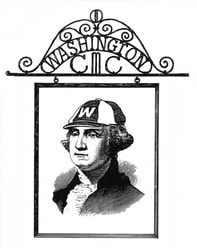
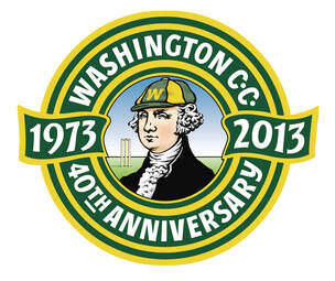
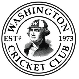
Since the 40th Anniversary in 2013 / 14, the club has effectively had two logos, the original and traditional pub sign logo, seen above on the left, and the more recent Kit Cooper arranged round shield type logo above on the right. These logos have been used interchangeably for various printed items such as shirts and booklets over the last few years. Whilst this doesn't really cause any major problems, as we're not a big global outfit, with the recent launch of this fancy new website (2019), we have decided to unify the cast of this dual branding and settle for one logo. We think the new design - seen all over this site and below - is a sophisticated and logical advancement which keeps the historical connection to the pub sign and the centrally placed George Washington, formalises the year the club came to be, and being perfectly round ensures the logo will suit most social media platforms without needing to be reduced in size to fit it all in! A win, win, win... which is like getting a hat-trick!
0 Comments
|


 RSS Feed
